Have you ever wondered how a logo is created?
A logo is probably the main element of the core of graphic design. It’s what everything in graphic design revolves around, starting from the brand identity until the advertising. It strongly contributes to build the identity of a brand, it conveys a soul and allows it to differentiate your brand to that of your competitor’s.
Let’s start from ABC: what is a logo? the term “logo” is the abbreviation of logotype, which is the graphic representation of a brand. Basically, it’s an image that defines how an enterprise or a person is perceived to be.
This is the process I usually follow when designing a logo.
Phase 01: The brief
The first important step to address when I start creating a logo for a company is the company’s brief. Usually it consists of a document in which the company tries to explain to me what their needs are, describing its main activities, the relevant commercial sector and its goals. This s a strategic step that takes a key role in the creative process. After reading the brief, I write down the keywords that stand out from the document. These keywords are the starting phase of each project I work on.

Phase 02: Sketches and choice of fonts.
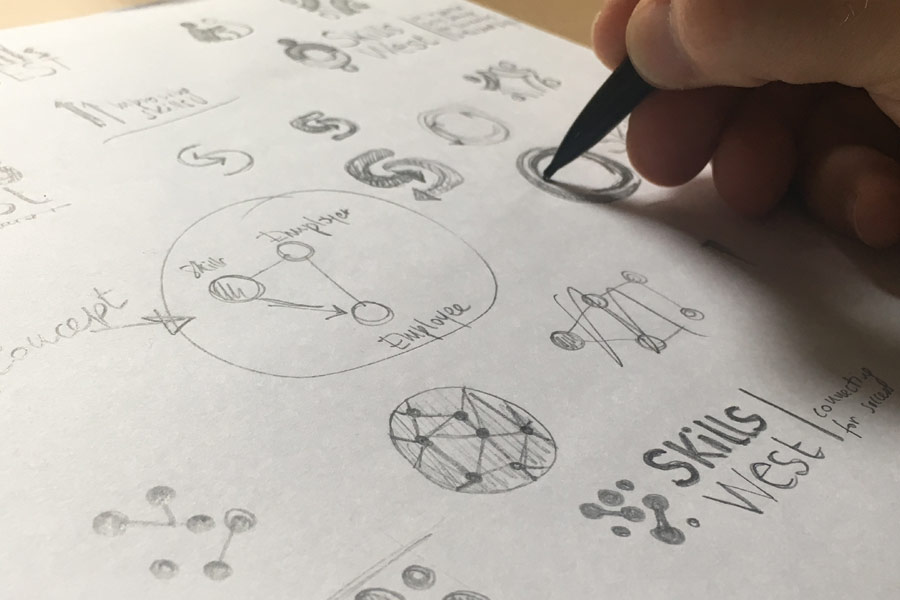
I have to start thinking about what the final logotype will look like, and I start with the most powerful tool I have – my hand. Do you know why I don’t work directly on screen? because it limits the potential of my creativity!
At this stage, it is important to analyse the font I want to use for the logo. Do you know why it’s important to pick the right fonts in this phase? because graphic designers have their favorite fonts and tend to choose the same ones! In this particular case I am talking about, the client already knew what font he wanted me to use, because it was part of their brand guidelines.

Phase 03: The concept and the naming
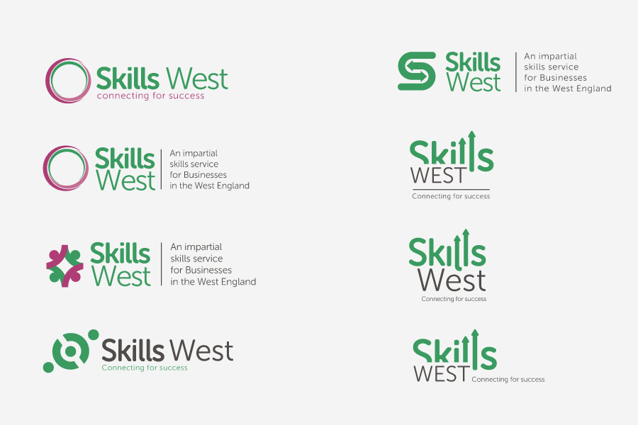
The creative process keeps going, and now it’s time to open Illustrator and let those ideas come to life. Now I have to pick the colours I’m going to use. The colour should be chosen according to the companies criteria and responding to the values that the company wants to convey (in my case, the client asked specifically for that green). But we nee to be very careful about colours, because each colour has its emotional range, given by the psychology property of colours. We don’t want to give the wrong message using the wrong colour, do we?

Phase 04:Delivery and feedback
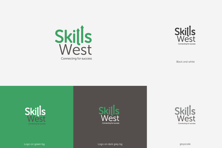
I usually come up with at least three different ideas: the first one (my favorite one), the second one (not very attractive and the client is going to be very happy to get rid of it) and the third one, which is usually the client’s choice (and usually not the designer’s choice). In this phase I usually explain in detail the creative process that brought me that result, and I give the client the monochromatic version of the logo, the grayscale version and the negative: in short, all the possible applications of the logo, thus creating an effective corporate image.
Of course, this is not THE process to create a logo, but it’s my process and every designer has their different one. If you think I can be useful for you and your business, send me an e-mail and let’s see what I can do for you.
Questions?
For further information call or email me:
(09:00 – 17:00 Monday to Friday)
